TACO BELL
Client
TACO BELL
Role
Creative Direction
Disciplines
BRAND IDENTITY, CREATIVE DIRECTION, GUIDELINES
Reimagining an icon for a culture-centric brand
As fast-casual dining evolved, Taco Bell set out to transcend the category and become a culture-centric lifestyle brand—a Category of One. The identity needed to feel modern, distinctive and relevant to a new generation while expressing the brand’s unmistakable point of view: exploratory, rebellious and always delivered with a wink.
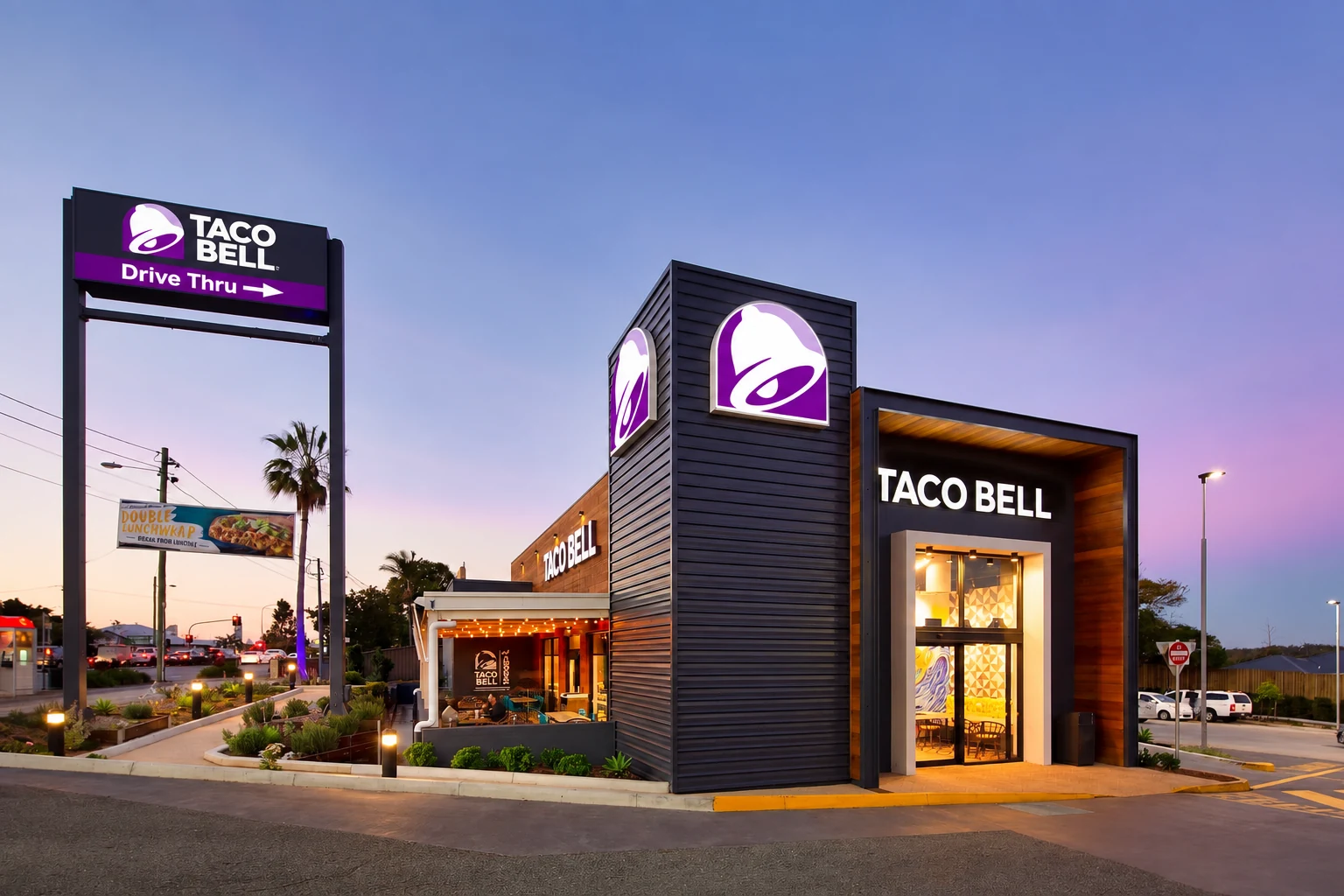
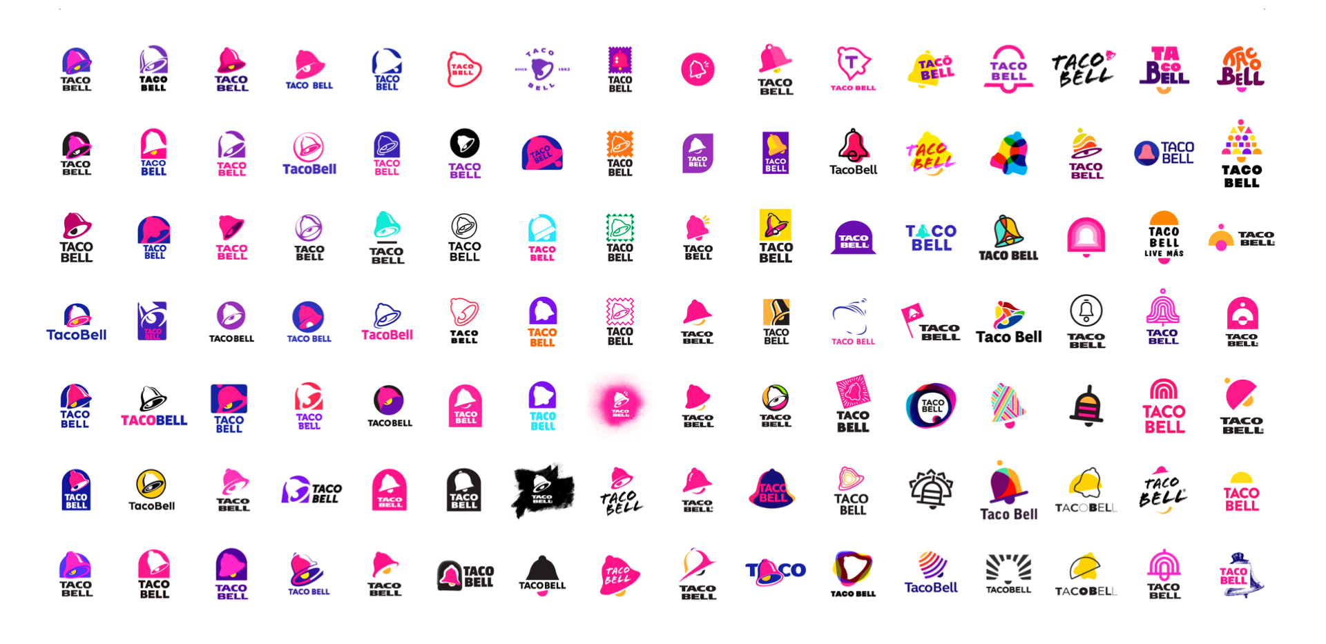
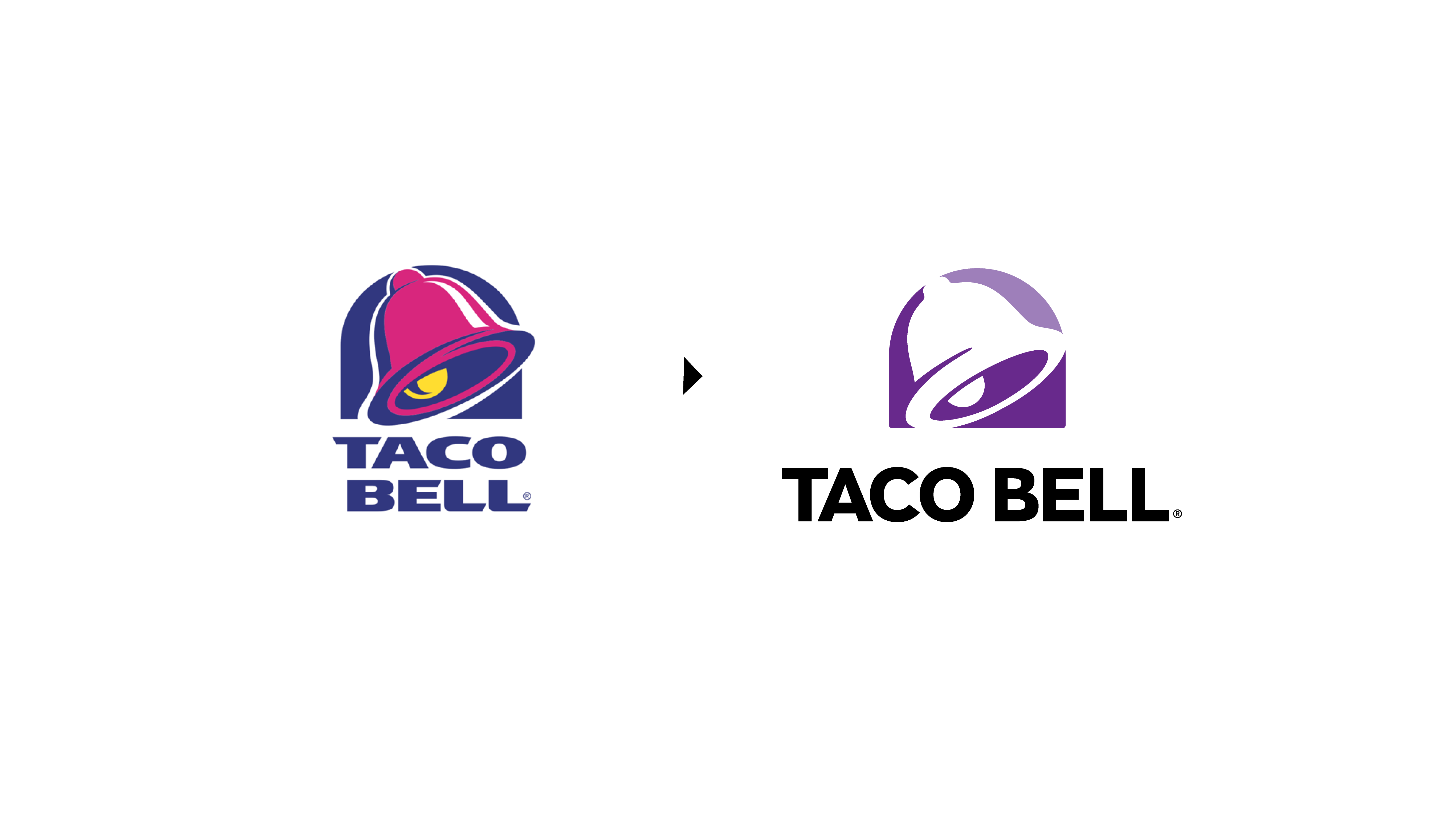
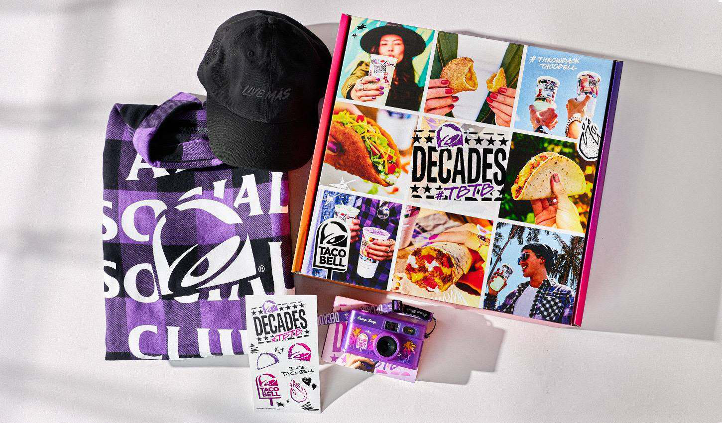
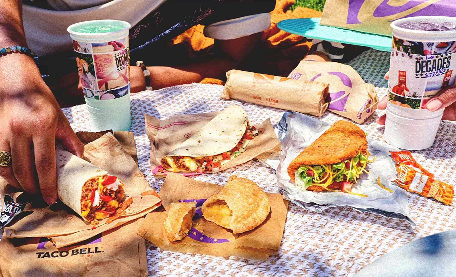
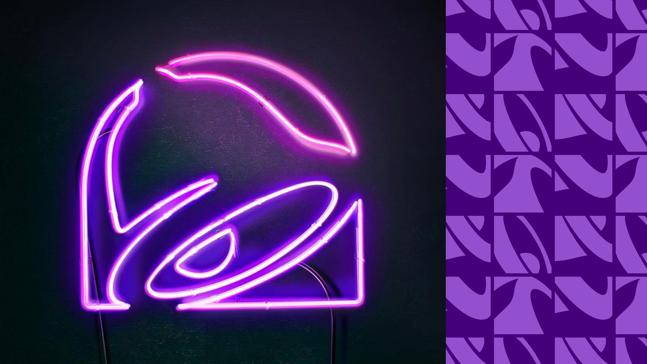
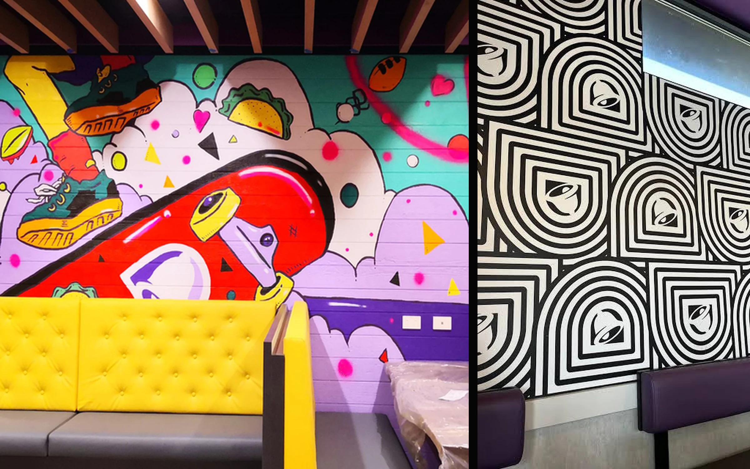
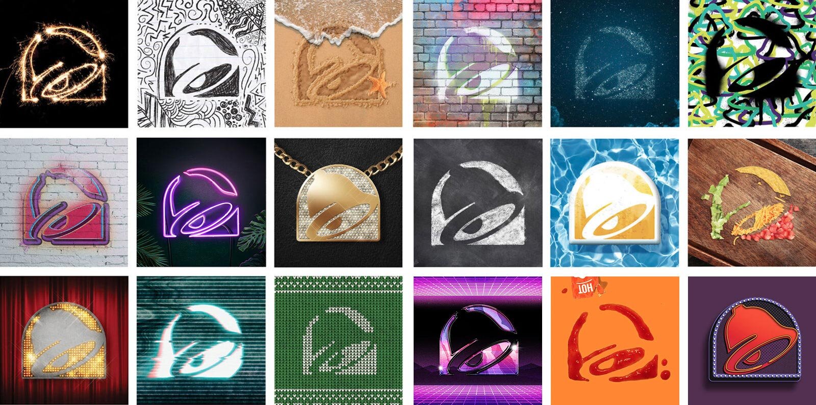
The answer was evolution, not revolution. We retained the beloved bell and streamlined its form around a simple principle: less is más. Opening the familiar silhouette created a flexible canvas for illustration, pattern, texture and imagery, while a more approachable wordmark improved clarity and legibility across digital channels, advertising, packaging and restaurant environments.
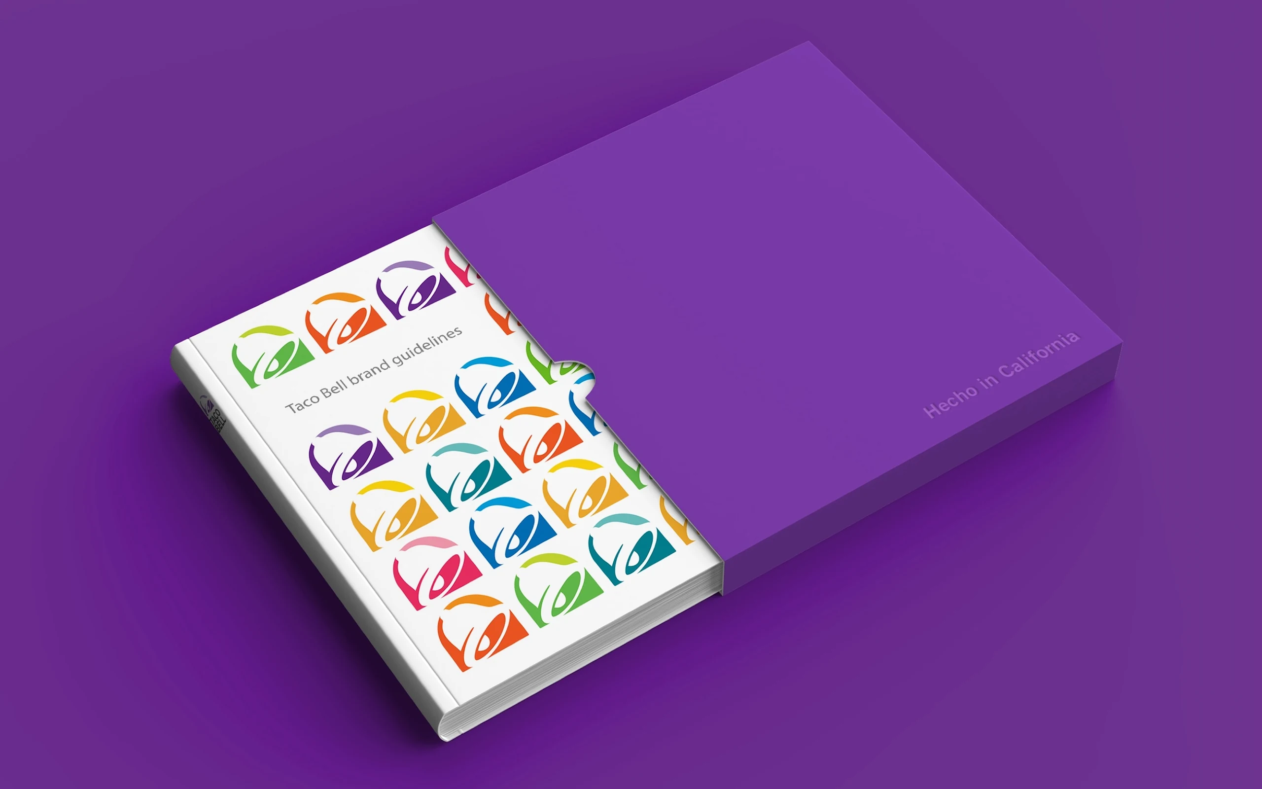
Color became another expression of the brand’s restless, cross-cultural spirit. Building beyond its signature pinks and purples, the expanded seven-color palette gives Taco Bell the freedom to explore new combinations without losing recognition. From neon and merchandise to food packaging and storefronts, the system is effortlessly cool, unmistakably Taco Bell and always one step ahead.